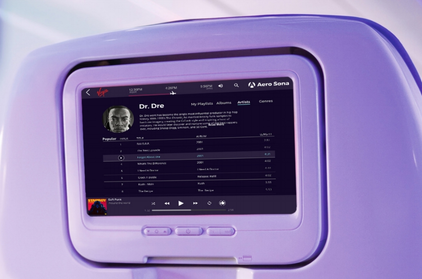
In-flight entertainment prototype
Some of the main challenges involved minimizing the light pollution that the interface would give off to the users. This device was designed to be used in an often dark lit space. Additionally, the interaction had to minimize the screen touching and swiping due to the position of the screen relative to the user.
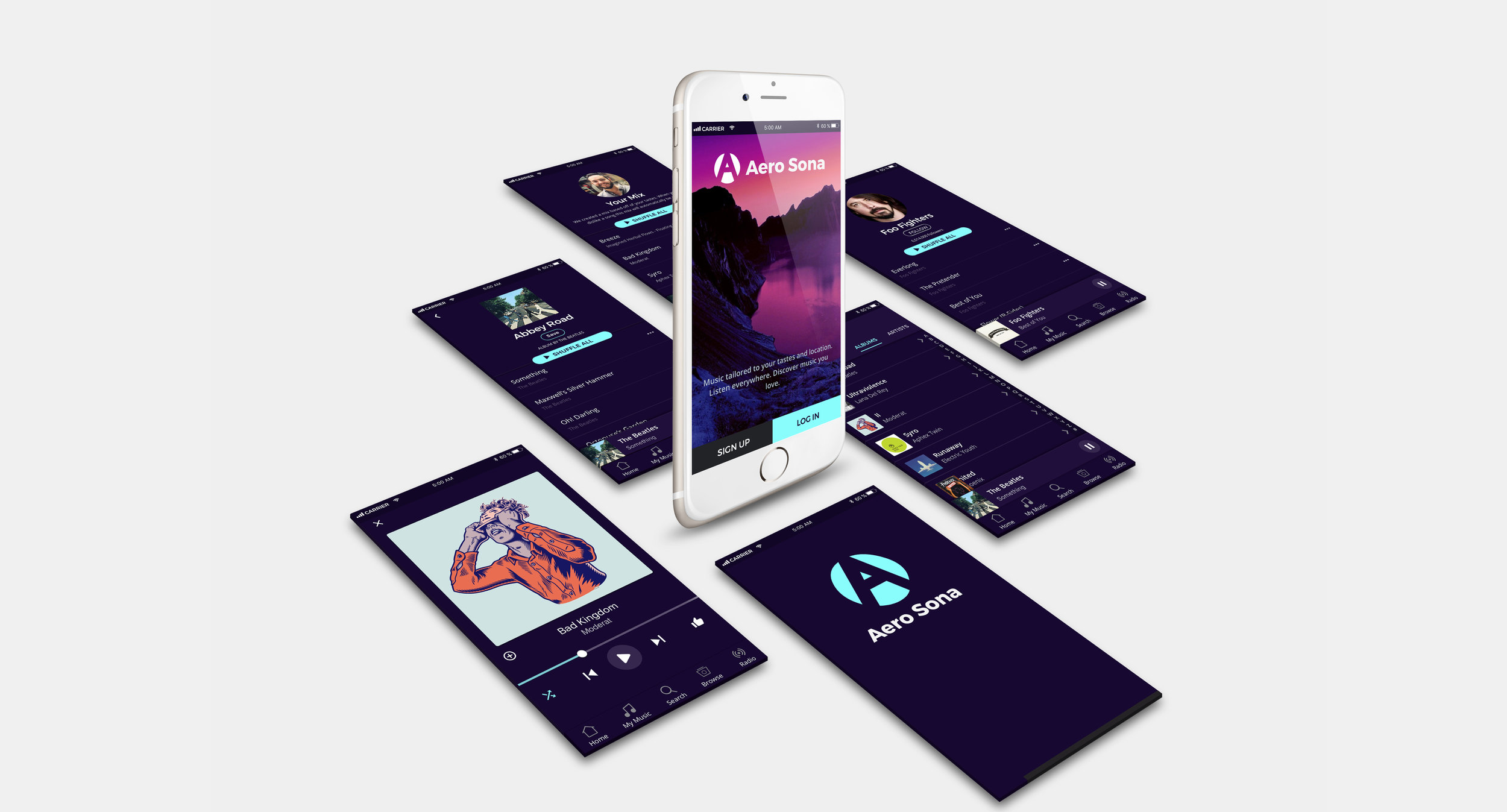
Mobile prototype
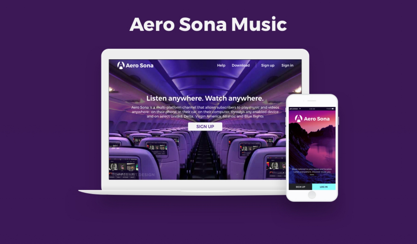
Website as a brand touch point
The website presented the first challenge of designing for a brand that needed to be adopted across mobile, web, print, and on-flight entertainment mediums.
Design Process
I conducted Visual research of the primary competitors in the music app space. The research created an understanding of the existing brands and highlighted potential areas for differentiation.
Visual Language
I generated multiple visual languages for Aero Sona's brand. These initial visual directions were used to further generate ideas for how the brand could look and feel.
Brainstorming
These tiles were used to explore specific typography, color treatment, brand descriptors, and button options for the Aero Sona app.
Final Brand Style
The final brand direction incorporates typography that is dynamic and easy to read on a wide-range of interfaces. The dark colors are used to minimize eye strain in dark environments.
Logo Development
The logo needs to be versatile and function across a variety of digital and print mediums. Sketching allowed many ideas to be explored quickly.
Final Logo Mark
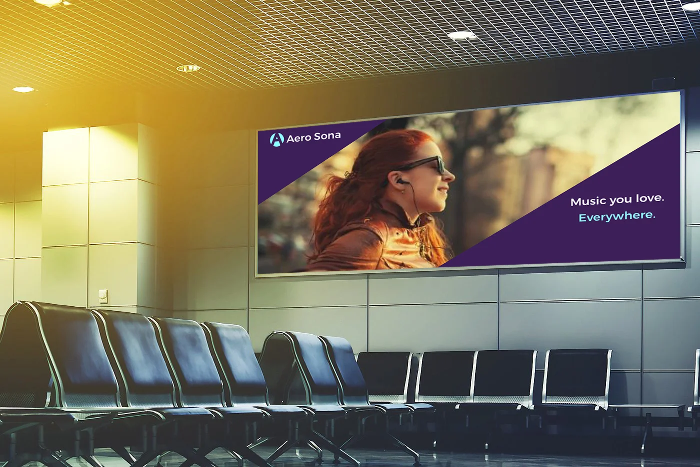
Marketing Concepts
Considering how to advertise Aero Sona outside of digital media.


