Design Process / Case Study
Design Goal
How might we improve the experience of doing laundry for individuals who live in San Francisco and don’t have in-unit washer/dryer?
Secondary Research
Key Takeaways from Secondary Research
There is a significant need for laundry services in San Francisco.
Some neighborhoods in SF have a dense concentration of laundromats within walking distance.
Renters are willing to pay a premium for in-unit laundry.
Many apartments don't have laundry access.
Laundry owners are exposed to increasing rent prices.
People value their time just as much as their money.
Empathy Mapping
I generated multiple empathy maps for my targeted user (SF tenant without in-unit access to laundry). In this exercise I identified what the user might be thinking, feeling, and doing during each step of the laundromat process. I used this tool to gain a deeper understanding of my user’s challenges.
I applied the same process to the experience of using existing laundry apps.
Takeaways from empathy mapping
The laundromat experience is very painful.
The primary pain point for existing apps is scheduling a pick up.
User have to be home for both the pick up and drop off.
There is no drop-off option in existing laundry app services.
Framing the design opportunity
The primary challenge of doing your own laundry and using apps is that there is a hidden cost of waiting/ being available. Is there a way for people to have their clothes cleaned without scheduling?
Initial Prototype
My research enabled me to understand the landscape of the laundry industry in San Francisco as well as the challenges facing its customers. Using this knowledge I developed an app concept that leverages the existing laundry infrastructure of densely populated neighborhoods. The app gives users the option to drop off their clothes at a nearby laundry service or have someone pick them up. Additionally, this platform provides laundromat owners an additional stream of income.
Wireframes
Multiple low-fi wireframes were used to generate the structure of how a user might move through the app.
Designing a style guide
This is a way to ensure consistent visual language throughout the app.
Designing mid-fi screens
This is mid-process, where I start applying some aspects of look and feel.
Key insights from user interviews
Armed with my mid-fi prototype I interviewed 6 users. This enabled me to generate core insights into how potential users related to my app. Some of the core takeaways are synthesized below.
Takeaways
Incorporating Insights
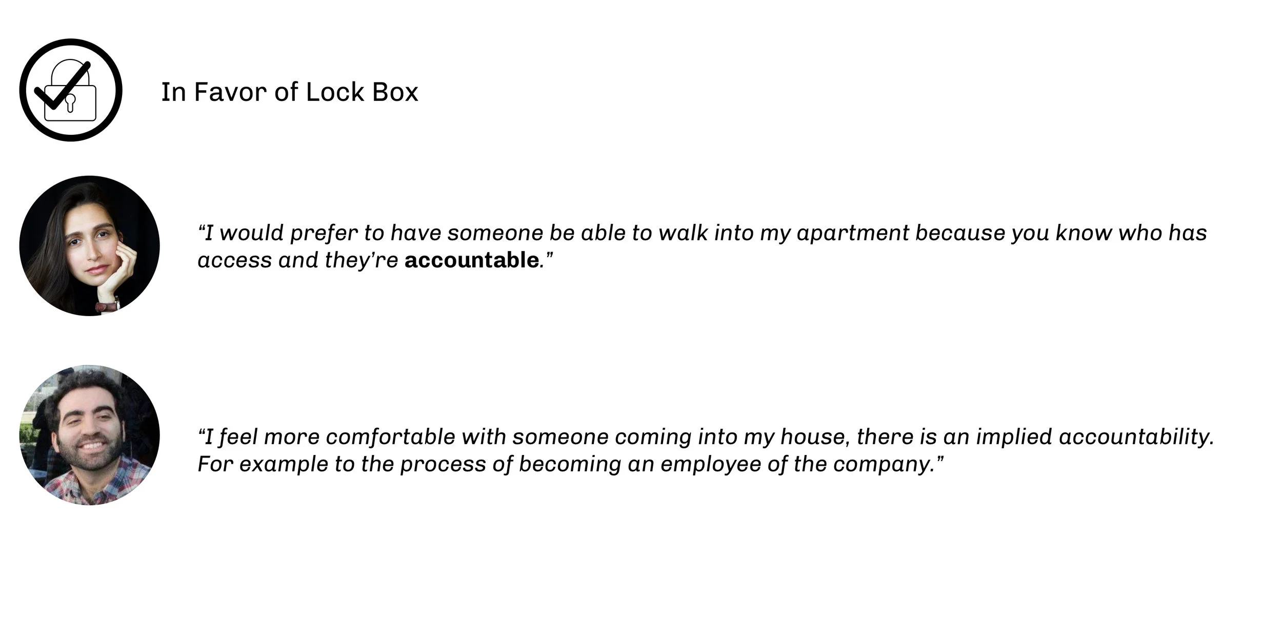
With these insights, I realized that this service needed access to the user's laundry even when they aren’t at home. It had suddenly become an access and trust problem. I brainstormed many solutions and converged on two promising concepts.
In(validating) Concepts with users
In order to develop the next step I needed to understand how users react to these two concept directions.
Conclusion
Users overwhelmingly want to let the service person enter their house to retrieve and return laundry.
Final Prototype
Incorporating many of the insights from primary research I redesigned the Oasis Service. Additionally, I updated the brand style and applied it to multiple touch points both physical and digital.
Oasis website
Design Standards
I documented a set of visual design standards for the app. By having a set of standards, I’m able to ensure a consistent visual language throughout the app.
Onboarding
The goal for on-boarding is to minimize the effort needed for a new user to gain access to the oasis ecosystem. The primary assumption here is that once the user receives their bag and lock they will be more likely to use the Oasis laundry service.
Placing an order
It is important to include only the essential steps needed for the user to request an order. Decisions are separated into clear actionable steps.
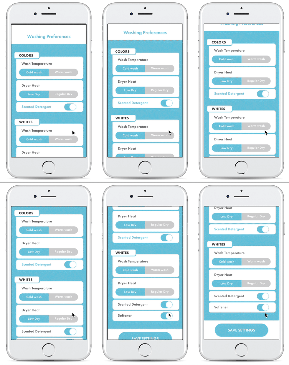
Washing preferences
One of the core features of Oasis is painlessly allowing users to select their washing preferences. I clearly isolated the decisions the user has to make into (either/ or) options preventing decision fatigue while streamlining the process.
Order status And service provider details
From the user interviews I learned that in order for customers to trust this service they need increased transparency. The need for transparency is addressed through design in multiple ways. First, the user can view the ratings of the service provider and see if they have been oasis certified, background checked and if they are insured. Additionally, they receive live info about where in the process their order is. This gives the user peace of mind knowing that their clothes are in good hands.


